The New Look Carbon 1 MK II

Hi All

We have some exciting news to share.

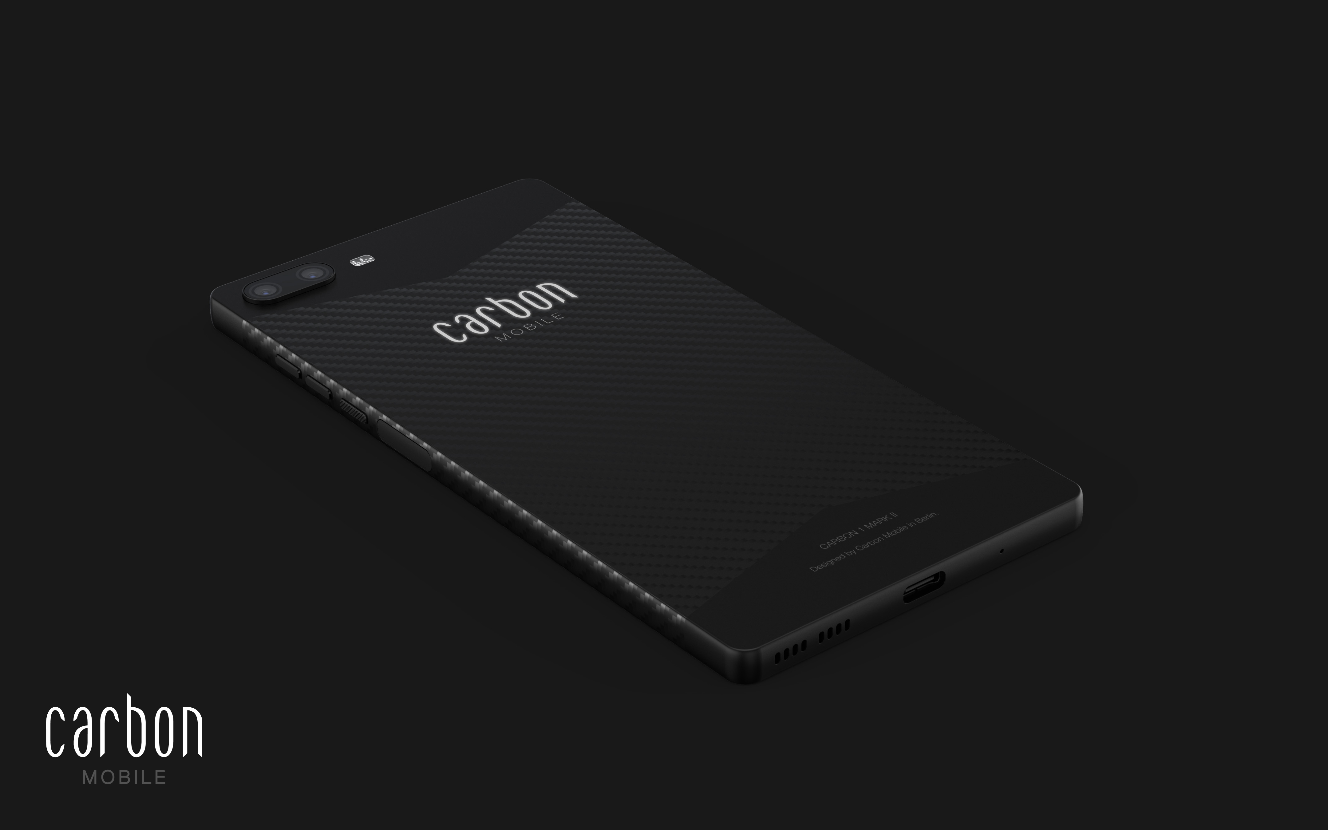
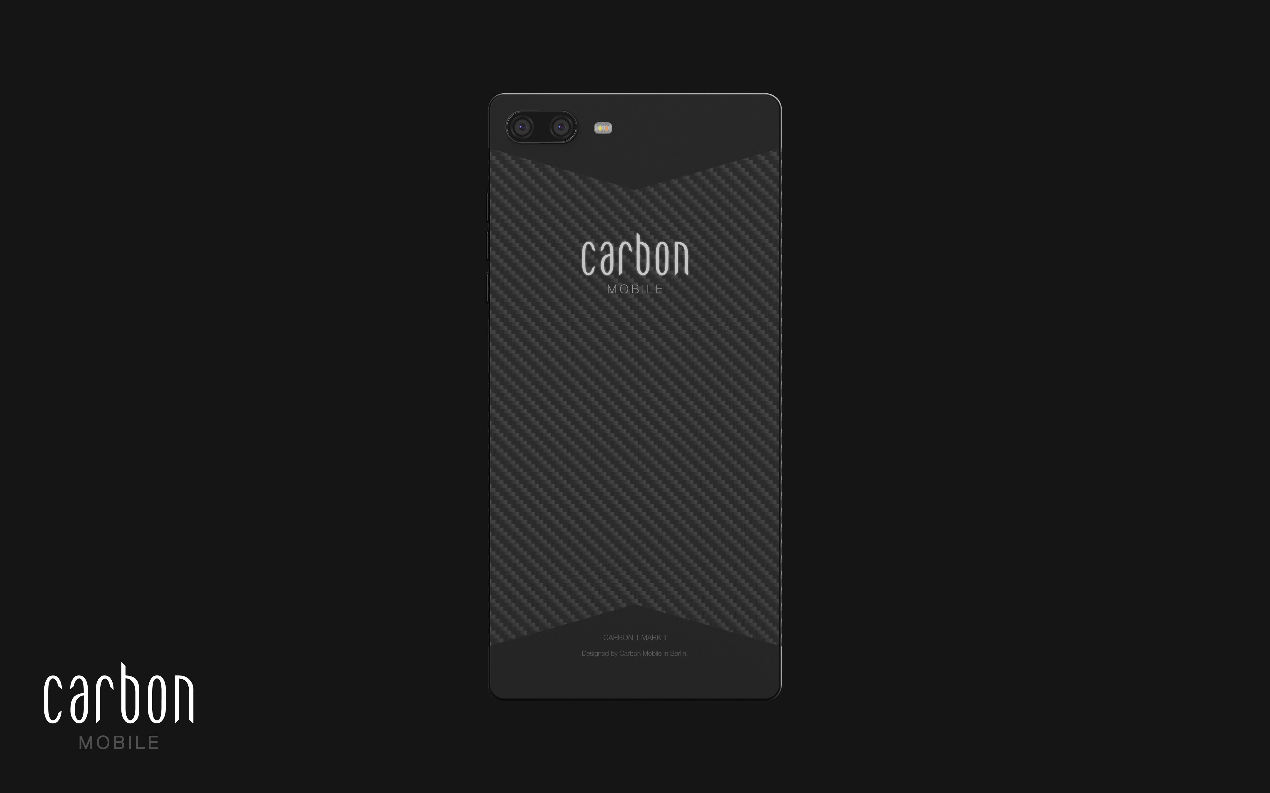
In the August production update, we shared with you the newly patented process for HyRECM Technology. One of the key functional qualities of this new process is that the hybrid line where carbon fibers and radio permitting fibers forge together is clearly defined.

On the call, we shared with you a test body without a silver line to show you the impact of this new process. Previously the silver lines added in the finishing process had a functional purpose to cover the hybrid line where the fusion area wasnā€™t as straight as the new process, this is no longer necessary.

We found the conversation that happened naturally with you on the call really interesting. A lot of you shared your opinion that the look is sleeker and more sophisticated without the silver lines. There was some debate of course but it opened up the conversation with our design team as to how we should move forward.

Led by our industrial designer, we believe that removing the silver line is true to Carbon Mobileā€™s minimalist design principles. To add a silver line now would actually mask the innovation in the product rather than highlight it. The more subtle, natural convergence of the two sections is also aesthetically more sophisticated than the disruptive silver divide.

We are really excited about this new look and hope you agree.

Please, let us know what you think.


8 Likes

Iā€™m into it. One thing that always irks me is the logoā€¦ Iā€™m not sure if itā€™s the font or something else.

It was going over in my mind but something more periodic table-esque in my opinion would look awesome. a bit more 2.0

D

1 Like

I do think that I preferred the silver line. It seemed to add a touch of brightness to offset the austere dark grey and black look. I also quite liked the delineation that it created between the full carbon fibre and the HyRECM sections. Thatā€™s not to say I donā€™t like it without the silver, I do, but I preferred it with.

Regarding the logo. I rather like the font as it is. Somehow it looks very ā€œStarship Titanicā€.

SST_title

Starship Titanic was very ā€œfuture retroā€. I could never get further than the startup screen as Iā€™m hopeless at all computer games. Douglas Adams left a huge impression on me. I quote ā€œthe Hitchhikerā€™s Guide To The Galaxyā€ on a nearly daily basis. ā€œStarship Titanicā€ was beautiful in concept and execution, I hope that the Carbon 1 Mk II will inspire me as much.

1 Like

I like that style very much. Looks so smart and cool! Go ahead, I likešŸ˜Š

This design looks elegant and completeā€¦ silver line did actually look like boundary demanding somethingā€¦ but this completes the carbon feelā€¦
Super like itā€¦
Never thought it would make so much of a difference till actually noticed.

1 Like

Prefer this design, much sleeker and as you donā€™t focus on the silver line.

Also make the design look more flush so look forward to seeing the finished device.

1 Like

I like it more than the previous design.

I like silver line design - it looks more elegant , special and expensive.

1 Like

The design without silver lines is indeed more aesthetic and sober.
Both models will have its fans.
For sure, the new model is more in lines with the Carbon ā€œstyleā€.
I prefer this one.

2 Likes

For me the Silver Line Design was perfect, it have the Carbon an elegant expensive look!

2 Likes

by the way, to me the charger is important too, I like flexible soft cable, intensive colour - helps to find faster :slight_smile: and high quality material which makes cable unbreakable. what about you, guys?

2 Likes

I expressed my preference for the silver line at the August eventā€¦ but I can live without it. And I like the logo very much.

4 Likes

First, thanks for the update.

I know how it was a big challenge to remove the silver line and really congratulation, you passed this challenge just as usual, congratulation Carbon team , :smiling_face_with_three_hearts:

Also, itā€™ll make us remember the story of the silver line any time when holding the device in hand.

Iā€™m proud of being a Carbonizer founderā€¦

3 Likes

i like it without the silver line, logo looks great, periodic table-esque is also an interesting idea but i think the logo is quite definite by now probably.
charger cables and headphone cables i think should also follow the elegance and of course agreed on durability and strength.
congrats on all the new steps taken!

3 Likes

simple and clearā€¦
cool!

3 Likes

I do not miss the ā€œsilver liningā€, but I think it would be more pleasing if the phases met in a roundabout way.

Ich vermisse den "Silberstreifen " nicht, fƤnde es aber gefƤlliger, wenn die Phasen rund aufeinander treffen wĆ¼rden.

Hi guys, itĀ“s time to start countdown - or what do you think? 3th of october is saturday and public holiday, so shipping should start on 5th of october. I am really curious who get the first carbon :smile:

3 Likes

old look?

1 Like

I like that style very much. Looks cool and minimalist Go ahead, Thatā€™s it a realy Carbon black

2 Likes