*suggest fixing the BASICS first before adding anything new.
NO GO for a TOP device:
No matter which device language is selected (German, Spanish, French…) English appears at the same position + in the SETTINGS / CARBONIZER everything is only in English (already addressed).
backside:
blinking CARBON-LOGO- cannot be identified by colour whether it is a mail, call or SMS. - Colour identification feasible? - Different messages: blinking with changing colour-lights.
Message light does not automatically eliminate LOGO-colour (if activated), blink after device goes into LOCK SCREEN mode - but BUBBLES has been activated in NOTIFICATIONS, then it blinks immediately.
(already addressed)
FRONT needs blinking notification lights in different colours in addition to the already existing LOCK SCREEN-information and backside is the big candy. - Feasible? - CARBON would have a top position in this category.
NOTIFICATIONS: Although “Notification point on APP symbol” is activated but no message point arrived on phone + SMS (email ok).
actually, not bad idea
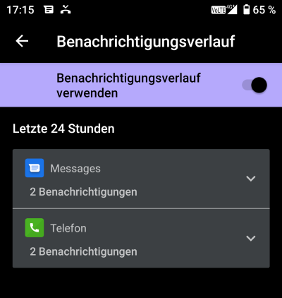
The sense – click in APPS & NOTIFICATIONS / notifications / BUBBLES to see a summary of reports in the notification history - **- probably at this point - ** I don’t see (totally useless!). - I could see possibilities: separate APP or click-in option in the above part of the screen.
I could also watch messages on the LOCK SCREEN in easy way. Is there anything I have not activated or too much?
To be honest: I miss the harmony (don’t mix too much in ways and actions). For me, no clear structure included. For the beginning - as a first step to solve things this way - ok. In the second step, unity should be created in order to be able to offer a round thing.
The button bar at the top (switch off…) is clunky/bulky and square - it looks unattractive. As a first better solution it was ok - CARBON works with round buttons/shapes. In order to have harmony - also round.
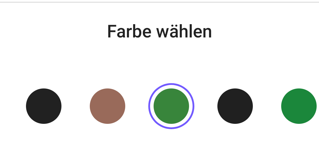
Typing into the screen to get DESIGNS I would have the followings:
- shows the double: black + dark green
- wish for light green
- standard + ocean - for me no colour difference recognizable
- not bad: colour sorting (light to dark od dark to light)
- circle format is missing for shapes
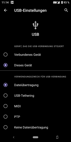
In the interests of a uniform look, everything is in list form for clicking - like USB-photo (or ringtone - perfect style + clear) with round buttons for selection.
To complete the whole in the best possible way, symbols should be set on the left and activity should be placed on the right - optimal.
Example: DESIGN purple is selected, shouldn’t more be available in that colour? Different colours - despite selected colour choice. (We are not talking about separate APPS as EXCEL.) Scroll line should change to purple more often (as in APPS & NOTIFICATIONS / extended) - it doesn’t
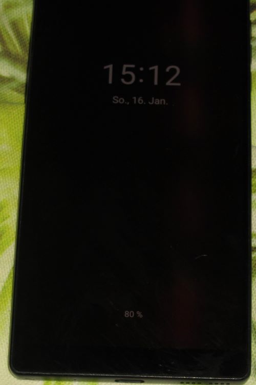
eeping an eye on the time: - Helpful idea with the “permanent time + energy display” for selected situations.
Who has any idea how I can eliminate this CORONA NOTE on GOOGLE. Has been annoying me since the first day I started.